


How to Combine Colors in Décor: the Art of Colorimetry
Colors have the power to convey emotions and sensations, which is why it is essential to know the keys to colorimetry and the chromatic circle. The latter helps us understand how colors are related to each other and how they can be mixed.
They can also influence the way we perceive spaces and how we feel about them. For this reason, at Keraben Grupo, we want to help you master the art of combining colors in décor. Take a look at how you can use them to your advantage to create unique environments in your home.
5 rules to choose the best color palette
These rules will help you to have a base from which to start when mixing colors in your décor.
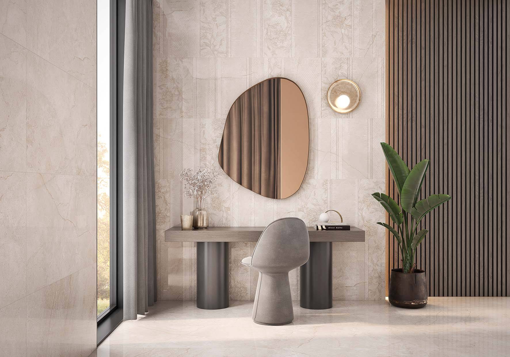
Choose a neutral base. Neutral colors, such as white, gray and beige, are ideal for providing a background against which other colors can stand out.
Get inspired by nature. Observe how colors combine in natural landscapes and plants. There is no better source of inspiration for the harmonious and combined use of colors.
Use the 60-30-10 rule. This rule will help you find a balance between the different shades you use. Spend 60% on the dominant color, 30% on the secondary one and 10% on details and contrasts.
Take advantage of digital tools. There are apps and websites that allow you to experiment with different color palettes without having to paint a single wall. Take advantage of them to get an idea of what the result will be like.
Color is not everything. Although color is a basic element in décor, you can take advantage of the textures and the furniture to enrich the space without overloading it with more colors. Choose two or three tones at most to give the other elements a voice as well.
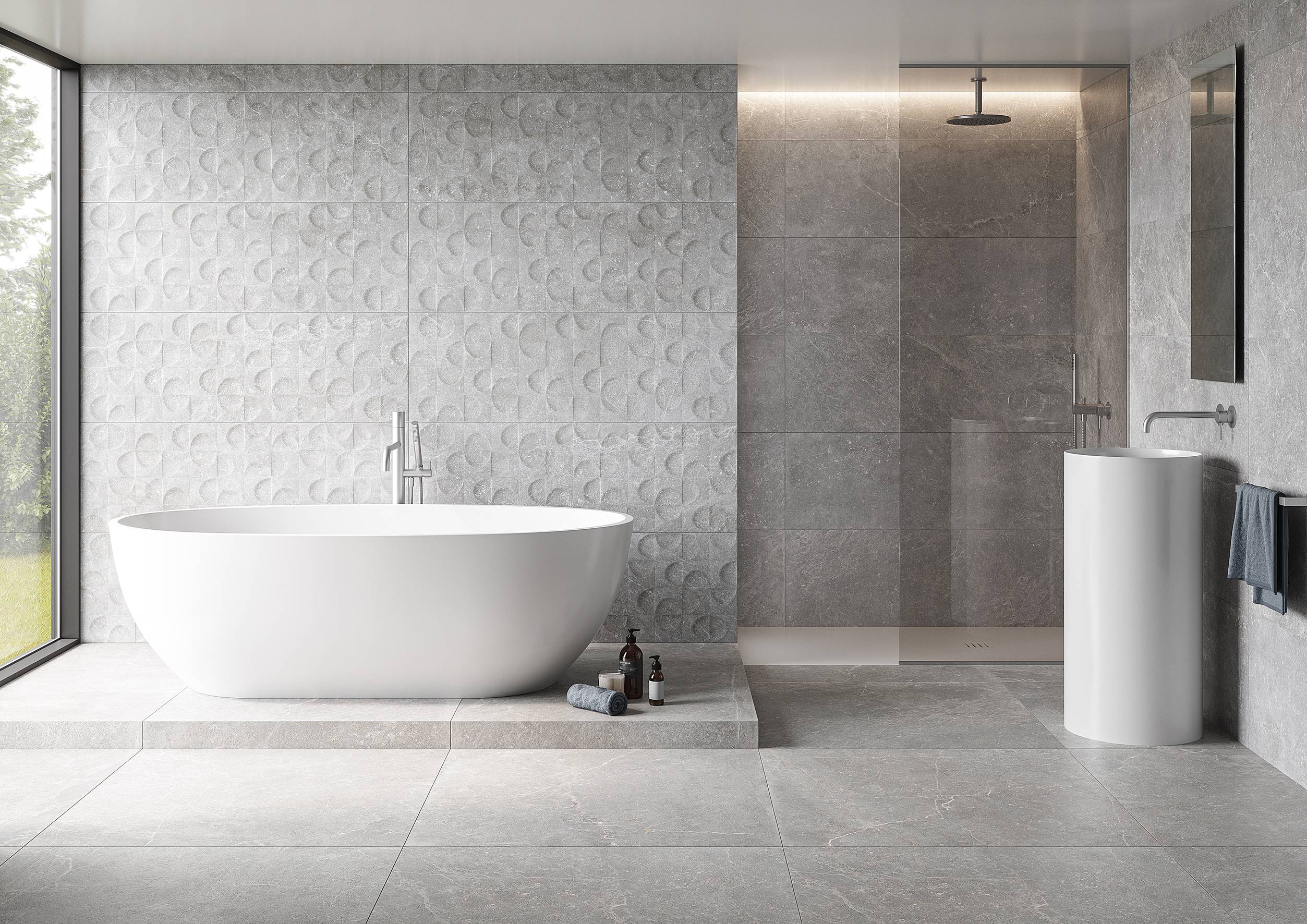
Neutral colors that combine well
Neutral colors, such as white, gray and beige, are ideal for creating timeless and elegant environments. In addition, they can easily be combined with other tones. For example, on a neutral base you can add details in pastel tones for a soft and romantic feel or use bright colors to give the space a more energetic touch.
Cool tones: a mix of colors that go together
Cool tones, such as blue, green, and purple, evoke serenity and calm. They are perfect for creating relaxing and sophisticated environments. For example, you can try combining different shades of blue, from navy blue to turquoise, for a cozy and refreshing effect in your home.
Color combination for rooms
If you are looking for the ideal color combination for your bedroom, get inspired by the following:
White and green. If you want to highlight freshness and vitality in your bedroom, creating a relaxing and natural space, then mixing white and green is an excellent option.
Gray and yellow. A room with this color combination is vibrant, happy and optimistic. Fill your space with joviality and a good atmosphere with this chromatic duo.
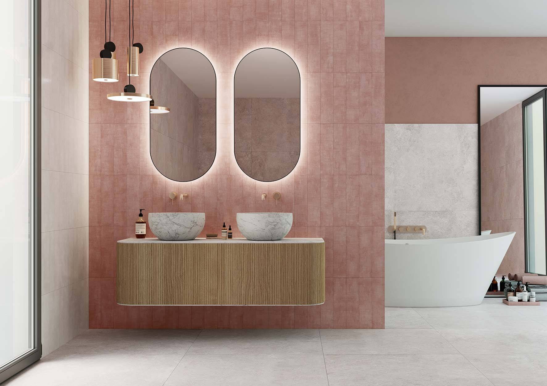
Pink and gold. Pastel pink in combination with gold details creates a sophisticated and glamorous atmosphere. For a room where you want to leave your feminine aura, these two tones will be ideal.
Color combination for living rooms
Living rooms are the most open space in the house and the place that sets the style of the home. Here are some appropriate color combinations for this space:
Blue and white. A classic that will never go out of style and that creates a fresh and elegant atmosphere. You can combine different shades of blue to add depth and dimension to the space.
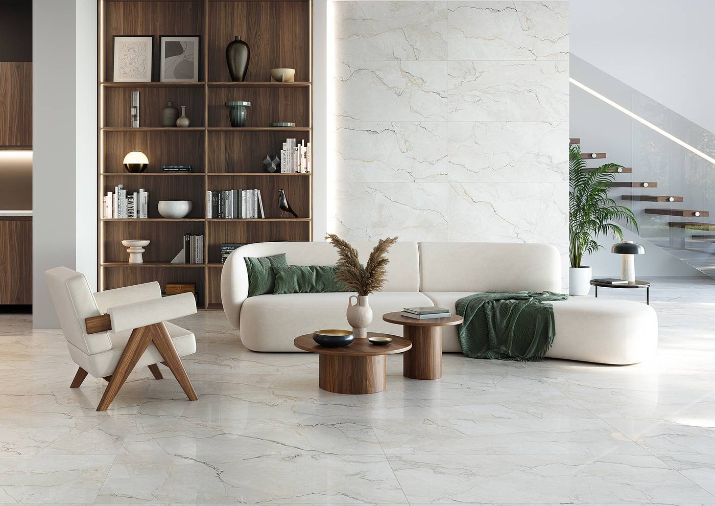
Green and wood. Green in its different shades, for example through the use of plants, together with wooden elements, creates a warm and welcoming atmosphere in the living room.
Gray and orange. Neutral gray contrasts perfectly with orange details, bringing energy and dynamism to the environment.
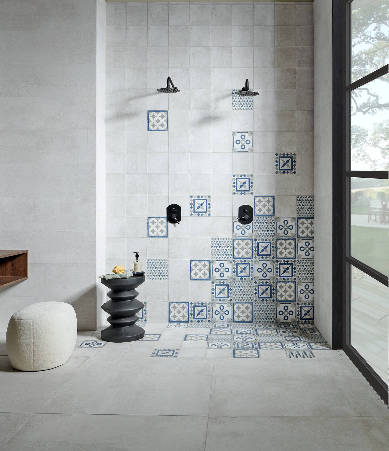
Color combination for bathrooms
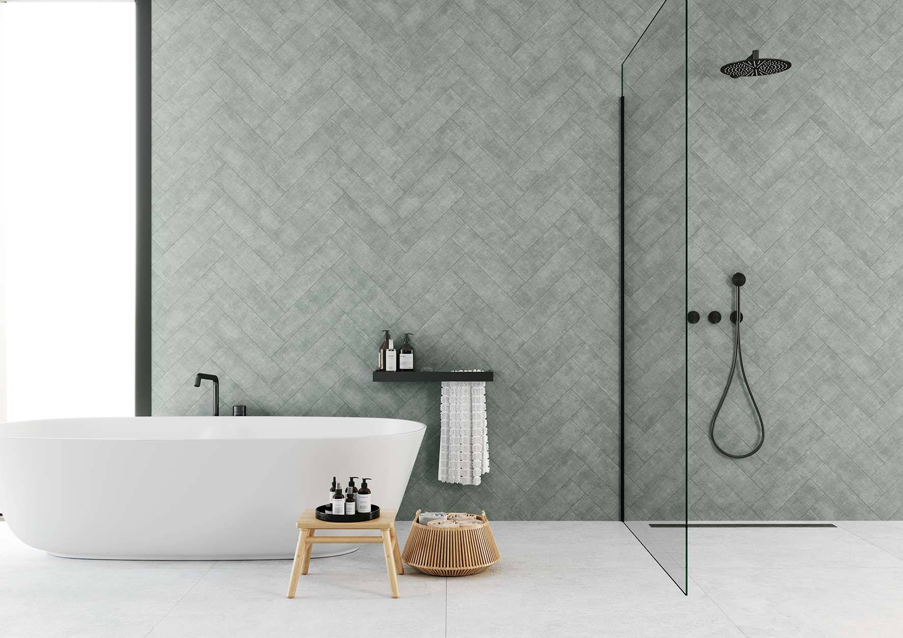
In the bathroom, the tight space makes it even more important to choose the shades carefully.
Black and white. A combination that never fails. It is sophisticated and never goes out of style. Porcelain wall and floor tiles from our brands Keraben, Metropol and Ibero, in black and white, can help you achieve this style.
Blue and sand. Blue, reminiscent of water, and sand tones evoke a very relaxing beach atmosphere in the bathroom.
Mint green and white. Mint green is a fresh and rejuvenating color, perfect for pairing with white in bathroom décor.
Now that you know some keys to mastering the art of color combinations in décor, you are ready to give your home a unique and personalized touch. Do not forget that Keraben Grupo products can facilitate the process and help you achieve dream spaces in every corner of your home. What combinations would you like to try? Experiment with mixing colors and transform your home!

